Art Marketing
Building a minimalist photography website to improve user-experience and conversion rates
Everything you need to know about minimalism, as applied to the design of photography websites: what minimalism is and isn’t, benefits and best practices of going minimalist, plus a lot of examples for your inspiration.
Collaborator Alex Vita shares his insider view on how to improve your website visitor’s experience with a minimalistic approach to design. Keep reading to learn more.

Contents
Why minimalism is important in web design
The overpopulation of the Internet demands clarity and simplicity.
Minimalism is the practice of restraint, of reducing a design or art form to the bare essentials, in keeping with the goals you have. Minimalism can have some extraordinary results on your website:
-It helps you prioritize and remove the superfluous
-It facilitates information accessibility
-It helps users focus and navigate the site with as little “friction” as possible
-It eliminates extraneous (design) elements to emphasize the content
-It can be the means to clarify and reach your goals
Despite all these benefits, minimalism has got a bad reputation.
Cleaning up minimalism’s reputation
Upon hearing the word “minimalism”, some people have wrong expectations: they go to the extreme and think about unattractive, overly-simplified designs. Let’s debunk some of the myths and set things straight.
Minimalism is not just a come-and-go fashion trend
Web design trends come and go like fashion (though probably at a slower rate). Yes, minimalism has the power to stay for a long time, because it’s a timeless concept that can be applied to many aspects of your work and life.
Minimalism is not (necessarily) flat design
Sure, they go great together, but flat design is just a visual aesthetic. You can still have a flat but cluttered website, without influencing its structure or content in any way. (You can also have a minimalist but very ugly/inelegant design).
For photography sites, a flat design can help reduce distractions, allowing the images to shine. Still, minimalism goes beyond that, helping you focus on the essentials and create a smoother browsing experience.
Minimalism doesn’t enforce solid colors
There are plenty of minimalist websites with (discreet) background patterns or gradients, without overdoing it.
With photo websites though, this needs to be carefully thought over: background patterns or semi-transparent images can indeed detract value from your actual photos, depending on how various design decisions were made.
Minimalism is not just “whitespace”
But whitespace usually does help tremendously.
Minimalism is not about arranging elements on a grid
If you have some experience in web design, you’re probably aware of the recent popularity of grid systems. They are great at organizing elements on a page and creating an eye-pleasing order of things, but not a necessity.
Minimalism is not “a lot of white” or just shades of gray
Simplicity has a strong relationship with grayscale colors, but she‘s allowed to see other people (colors). Minimalist websites are known for using bold colors to emphasize certain page elements, to create contrast, and to guide the user’s attention.

Minimalism is not “over-simplification”
It’s just simplification with clear goals in mind. A well-thought-out, minimalist site makes browsing easy and helps increase conversions.
Minimalism is not cutting everything down in half just for the sake of it
Instead, it’s a purposeful reduction of design elements, until nothing else can be further simplified, without affecting the main goals you’ve set. Don’t confuse minimalism with simply removing elements from the site. Removing site stuff is easy, but achieving minimalism is not.
Minimalism is not big typography
This is indeed a trend in web design, but it’s not necessary for achieving a minimalist design. This is especially true for photography sites: empowering the written word (using large font sizes) can have a detrimental effect on the visual impact of your photos.
Minimalism doesn’t necessarily lead to a great design
But it usually increases your chances of getting there.
Minimalism is not boring
Not if you don’t let it.
Minimalism is not the same as simplicity
It does include some features of simplicity, but it’s a different concept: it’s a difficult practice done by/for people who fully understand the rules and reasons behind the website.
Minimalism is not easy to achieve
Most designers will tell you that a minimalist website/illustration/artwork usually takes a lot more time to build. Simplicity has a lot of work behind it.
Benefits of building a minimalist photography website
Helps you prioritize
Minimalism introduces a set of design limitations, forcing you to thoughtfully figure out your business goals and choose the elements on your website. Limitations are good.
Letting go of clutter, you’re forced to prioritize, and this can be a tremendously good thing. It’s, again, a matter of quality over quantity.
Better conversion rate
Presented with simple options, visitors will be able to find and use content easily, resulting in less confusion, lower bounce rates, and higher engagement and trust.
Better user experience
Given fewer but clearer choices, visitors have a more pleasant browsing experience. Minimalism in web design conveys a sense of confidence that users pick up on: you’re courageous in stating your message clearly and discarding the less important things.
Keeps the content fresh
New content should no longer add to the design clutter, but should instead take the place of some existing content. This keeps websites from becoming “stale”, keeping things fresh (something that both users and search engines love).
Faster page load times
Fewer page elements and a simpler design both lead to a faster user experience. The user’s browser doesn’t need to download various textures/graphics or render shadows and other visual effects, all for a snappier web interface.
Easier maintenance
Without too many elements piling up, it’s a lot easier to do an objective review of the site and clean it up from time to time. Slimmer websites simply have fewer upkeep costs.

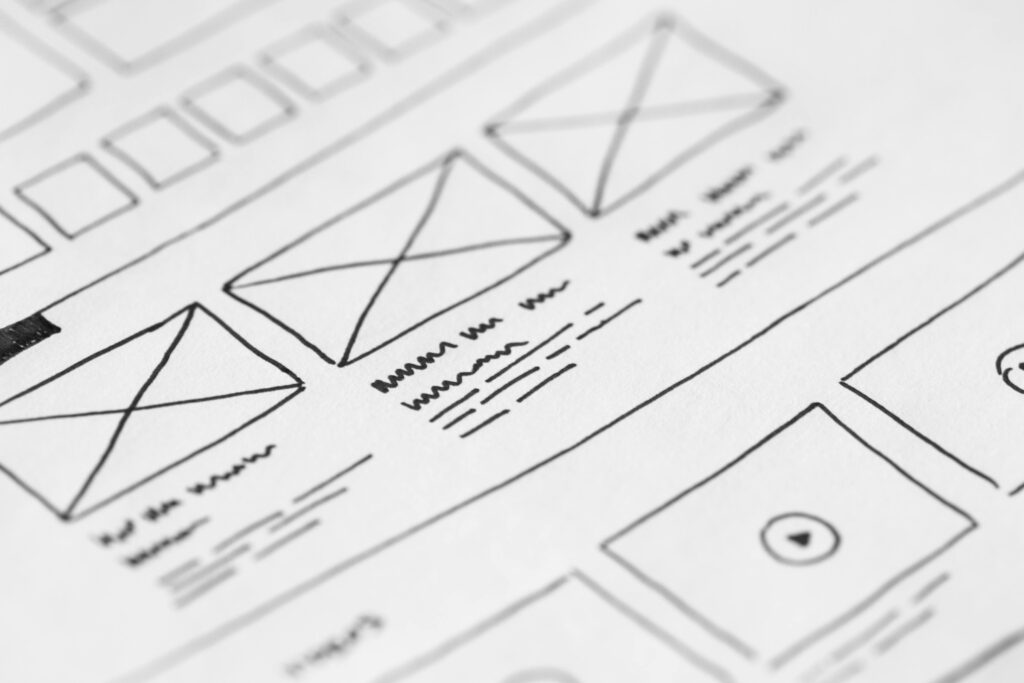
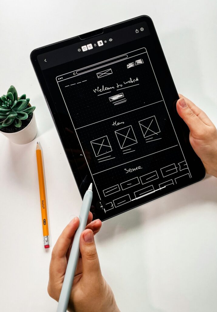
How to build a minimalist photography website
Limit visitor’s choices
The main purpose of your site is to let visitors view your images (or reach your main conversion goal: contact you, purchase prints/products, subscribe to a workshop, etc).
Crowding their view with too many choices only distracts them. Offering fewer choices is minimalism at its core: make the browsing decisions as easy as possible, and guide the way they navigate the site.
You might have already heard of the multiple-choice experiment done with supermarket varieties of jam. Why not apply the same mindset to the number of (featured) galleries on your homepage? Or to the number of products you advertise?
And when you reach a place where the design doesn’t feel quite right, don’t fall into the trap of adding more elements to fix it. You should instead remove unnecessary ones after a thoughtful review.
Simplify your navigation
Studies have shown that people are usually able to keep only 5-7 items at a time in their short-term memory, so you should ideally keep the number of menu items as low as that. Adding more than that only makes them less prominent, losing importance.
It’s not just about the number of menu items, but also about the position of the navigation, consistency throughout the site, avoiding dropdowns whenever possible, using common labels, setting items in the right order, etc.
Simplify graphics and embrace flat design
Flat design became popular recently and replaced skeuomorphism (the use of gradients, textures, drop shadows, and realistic 3D effects). It now got deeply embedded into apps and operating systems we spend a lot of time with (iOS, Windows 8, many web apps), and usually comes with solid colors.
Add whitespace
Negative space can help the design of a site tremendously.
But how can an empty space be useful? It lets the other (important) elements breathe, it guides the eyes on the page. Adding too much stuff on a page (just for the sake of adding more and more functionality) only confuses people and hurts the browsing experience. Whitespace can help add legibility to your text-based content and convey a more elegant look.
Avoid overuse of color
A minimalist website is usually built upon a main background color (usually white works well for photography sites) and one or two accent colors. Small patches of color are great to guide the user’s attention, to tell them what’s important on the page.
Too many splashes of color turn into clutter, try to keep things simple. With fewer elements on the page, color usage becomes very important. The color palette you use, and the quantity you use it in, can help or harm your website.
Simplify your typography
Using modern, easy-to-read fonts and setting an adequate line height are common best practices for web design. What minimalism adds to the equation is the need to limit your font choices: avoid using more than two or three font faces and styles on a page, it usually looks messy.
Edit down your images
-Reduce the number of slideshow images to 10-15 max (and put them in the right sequence)
-Limit the number and size of galleries (unless you’re selling stock photography of course, where quantity also matters)
-Edit your texts down to the essentials. It’s OK to leave room for your personality, but try to remove the superfluous.
Omit needless things
This phrase was coined by Leo Babauta of Zenhabits.net (which is the best place to learn about applying minimalism to your daily life) and can be applied to web design to great effect. It’s all about figuring out the unnecessary elements in your website and removing them.
A few ideas to get you started:
-Does your website have a ton of social media buttons and widgets? Try replacing them with discreet social media sharing buttons
-Do you have a ton of widgets in your blog sidebar? Sidebars should offer utilities to help browse your site, without being an attention magnet
-Eliminate any other distractions
The idea is to experiment with things simply: try removing some elements and then check your stats (Google Analytics, sales, messages from clients, etc.) to measure the effects.
Eventually, every element on a page should have a clear (measurable) purpose, otherwise, it’s just “noise”, throw it out.
It’s easy to go overboard with this: with little experience, you could break a design (from an aesthetic or functional point of view), it’s all a subjective process. So whenever possible, try contacting professionals to handle changes in your website design.
Upgrade your logo/branding
Your website logo draws a lot of looks, so it needs to be in sync with the rest of the site.
Make sure that your logo has enough contrast with the background color, and that it works well as a monochrome version too. If you have or need a more graphical logo, consider hiring a good designer as it should be the foundation for the rest of your website’s design.
Emphasize key elements
After you’ve narrowed down your priorities for a page, you need to put the main focus on at least one important item: your intro message, a featured gallery or slideshow, a recent event or product, etc. Whatever’s most important for your visitors to see first.
To simplify this process, imagine you have a close deadline and this will help you prioritize. If you were forced to rebuild the site in a week, what would you do? What elements would you keep?
Alex Vita is the creator of foregroundweb.com, an educational website for photographers with insider knowledge on how to apply web design and SEO best practices to create a thriving photography business. He runs a weekly newsletter with exclusive website and business advice for photographers.