Artist
How to mix Wall Colors with your Artwork: Color of the Year and Color Trends 2023
Understanding the subtleties of colors is art itself. As an artist, you’ll probably crave to master color swatches using your preferred technique: how hues show up in your medium once they dry or once you develop your RAW photographs. Mastering colors is also important when it comes to the marketing and communication of your body of work. Here, you’ll learn how to create provocative marketing materials to make your artwork stand out.
Let’s go through the fundamentals of color theory, talk about all the 2023 Colors of the Year we know so far, and the top most loved colors per country. Additionally, we’ll explore how to use these hues as wall colors in room mockups to make compelling visuals where your artwork will stand out.
Contents
Basic Color Theory: The Fundamentals
Color theory is the body of practical guidance for color, let’s say it’s the science but also the art of using color. It describes how human beings perceive color and the effects of how colors blend, match, or contrast with each other. This science also involves the messages a color communicates.
In color theory, colors are organized on a color wheel and grouped into 3 categories: primary colors, secondary colors, and tertiary colors.
Draw a line through the center of the wheel, and you’ll separate the cool colors (blues, greens, purples) from the warm ones (reds, oranges, yellows).
Warm colors are generally associated with energy, brightness, and action, whereas cool ones are often identified with calm, peace, and serenity.
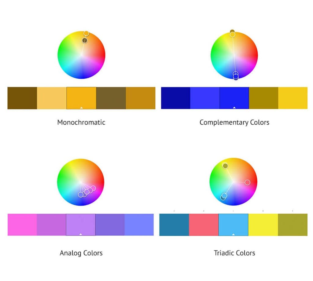
Color Scheme vs. Color Palette
Since the terms “color scheme” and “color palette” refer to the colors that you choose for your project, these are regularly used as synonyms. When it comes to color theory, there are specific color schemes that describe how the colors from the color wheel are selected and brought together, some of these schemes are: monochromatic, complementary color, analog colors, and triadic colors. Whereas the term color palette is more specific, and it can be found in nature, personal taste, and trends.
Monochromatic
Monochromatic color palettes are made up of a single base hue, then extended with that hue’s shades, tints, and tones.
By adding black, white, or gray to a color, you can create a consistent and versatile monochromatic scheme that’s very easy on the eyes. This is a very simple and effective choice when selecting a palette.
Complementary Colors
Complementary colors are opposites on the color wheel. These are red and green, purple and yellow, and orange and blue. The sharp contrast that complementary colors create can really make visuals pop.
Analog Colors
Analogous colors are placed next to one another on the color wheel: purple, blue, and green, for example. It is usually said that when designing an analogous scheme, one color will be predominant, one will act as support and another one will accentuate the selection.
Triadic Colors
Triadic colors are evenly spaced around the color wheel, forming a perfect triangle, and tend to be very vibrant.
Using a triadic color scheme in your artworks or visual materials will create contrast and harmony at the same time.
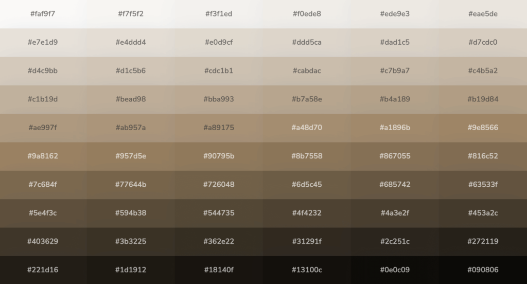
The Top Most Loved Colors
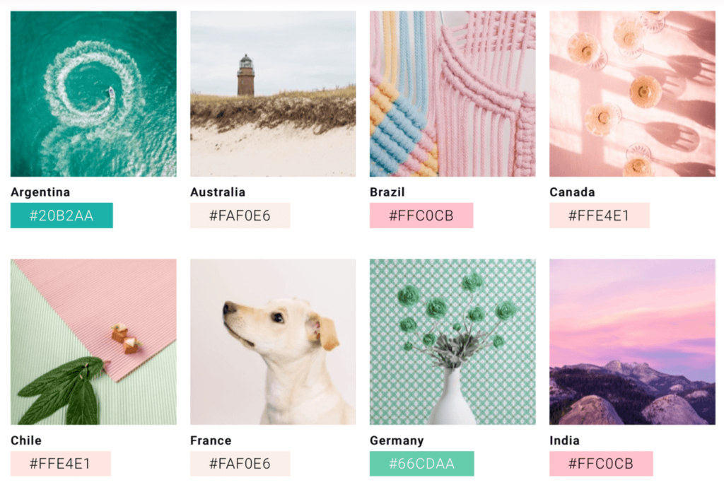
Have you ever wondered what the most popular color in the world is? It turns out many surveys have been conducted along the years, and the discouraging conclusion is that humanity’s favorite hue isn’t constant. The answer varies with the year, survey method, and population sampled. Appreciating hues is highly influenced by culture.
According to Shutterstock, in 2022, some popular colors by country are: Argentina #20B2AA, Australia #FAF0E6, Brazil #FFC0CB, Canada #FFE4E1, France #FAF0E6, India #FFC0CB, Italy #FFB6C1, Japan #F5DEB3, South Africa #FFA500, Spain #F4A460, United Kingdom #FFC0CB, United States #FFE4E1.
Whatever the current trend may be, it’s important to understand how to play around with these shades in order to make the best out of them.
The Biggest Color Trends to keep an eye on 2023: from calming neutrals to bold brights
Each year, the color experts from all the leading paint brands in the world choose their Color of the Year. They accompany this decision with a color forecast and color palettes that complement the color of the year beautifully.
According to NCS Color, a global provider of color communication solutions, 2023 is a year of reinvention and of a new normal. “We refocus on the reflourishing of our planet, with a sense of individual responsibility. It will be a very physical and very digital world. These worlds will join and co-exist.”
“This year’s trending colors reflect our desire to get back to normal and create a cozy and welcoming environment with a touch of luxe.” says PPG, a global leader company in paints and coatings.
Trending colors don’t only show up as wall colors in homes, but they are visible in every art form. Published for the fashion industry by the Pantone Color Institute, the London Fashion Week Spring/Summer 2023 Season Report features ten standout colors as well as current takes on classics. The 10 magnificent colors are: Cherry Tomato, Persimmon, Iced Mango, Blazing Yellow, Titanite, Andean Toucan, Airy Blue, Electric Blue Lemonade, Spring Crocus, and Pink Cosmos.
“As we anticipate our future, we are embracing the freedom to colorfully express our individuality without constraint,” said Leatrice Eiseman, Executive Director of the Pantone Color Institute. “Experiencing a creative liberation that transgresses previous norms, we are adapting and inventing novel pairings and contrasting harmonies.”
Sherwin-Williams: Redend Point
This year, the paint company Sherwin-Williams chose a warm neutral called Redend Point. This color “celebrates restorative energy, well-being, and kindness,” according to a media release from the brand.
“Redend Point was inspired by the idea of finding beauty beyond ourselves. It is a heartening hue that invites compassion and connection into any space. The color is a natural choice for those looking for a warm and joyful neutral in both interiors and exteriors.” said Sue Wadden, the director of color marketing at Sherwin-Williams.
Neutral colors are by their nature the most easy-to-use of all colors. Most individuals don’t register neutral hues as colors, which means they can act as a backdrop to other, more vivid colors. A subtle, neutral tone like this one can create effective compositions with almost every other color in the spectrum.
Pro tip: Redend Point translates to digital as HEX #AE8E7E

WGSN and Coloro: Digital Lavender
Color forecasters have predicted Digital Lavender to be the color that is set to make waves in the interior design world and will take over the fashion scene (there have been lots of glimpses at the New York, London, and Milan fashion weeks).
We’ve all seen Pantone’s 2022 Color selection, Very Peri. This 2023 prediction is a more subtle lavender tone, since softer tones and pastels help people find solace and peace. It conveys a sense of calmness and cheerfulness that soothes the mind.
According to Joanne Thomas, head of content at Coloro, it “signifies that stability, tranquility, and digital escapism that so many of us have incorporated into our recuperative rituals to both safeguard and promote our mental health in trying times.”
Pro tip: Digital Lavender translates to digital as HEX #B2A4D4
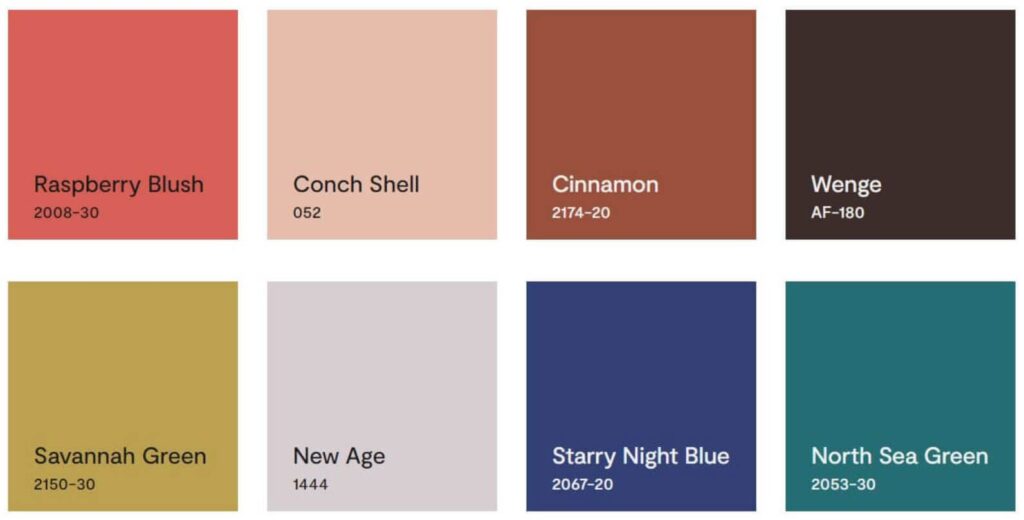
Benjamin Moore: Raspberry Blush
The paint company Benjamin Moore chose Raspberry Blush, a cheerful coral shade tinged with pink. It is a very bold and charismatic color that will make a great statement. If you decide to combine it with neutral hues, this shade will act as a bright accent but if you’d rather mix it up with other bold shades, you’ll end result will be vibrant and energetic.
Benjamin Moore has also created a color palette with eight colors that complement the color of the year. “These eight hues offer inspiration and creativity while encouraging a push beyond the traditional to experience truly exceptional color.”, mentions the company in a press release.
Pro tip: Digital Lavender translates to digital as HEX #D25F57
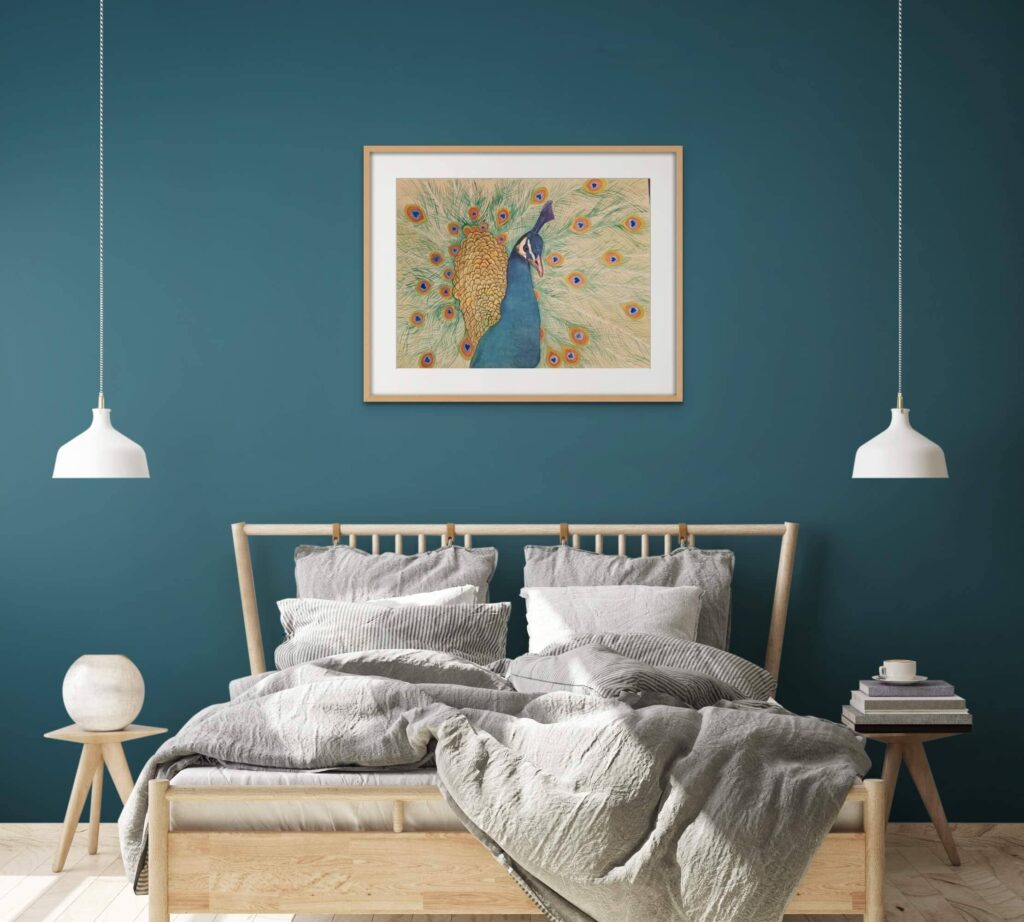
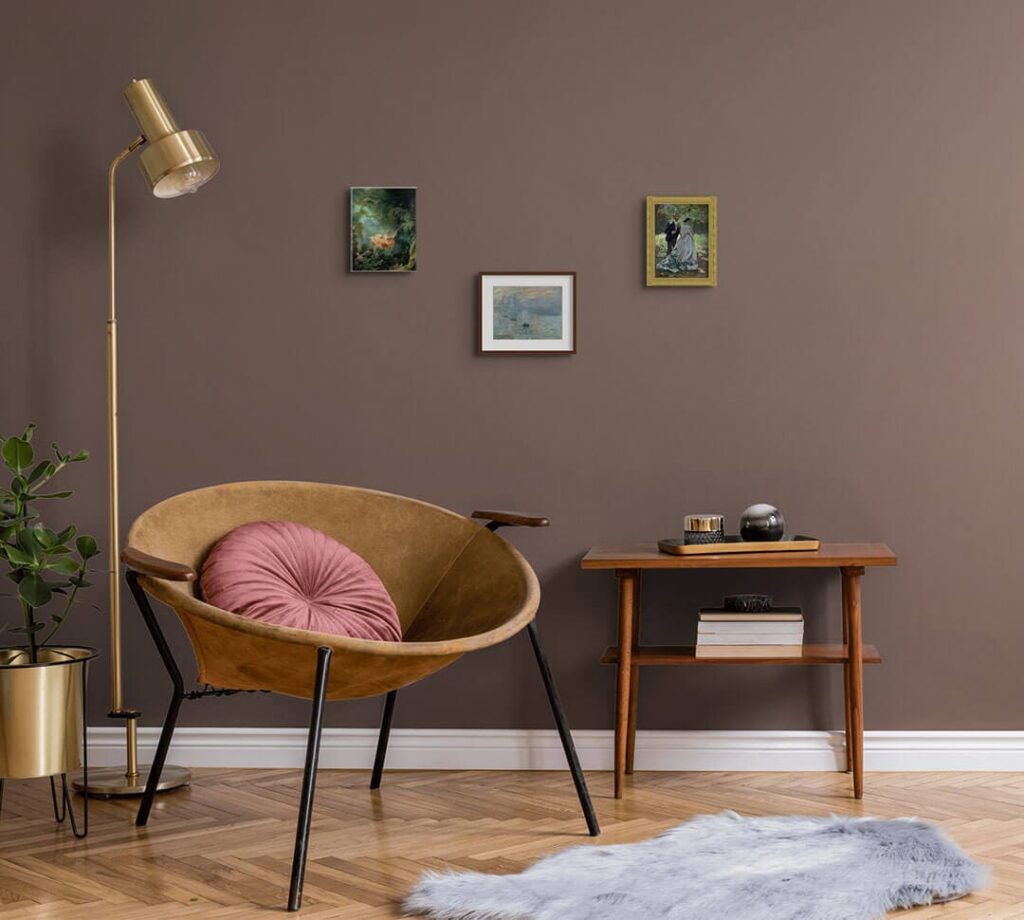
Sue Deacon used Dulux’s Kimberley Sea to colorize the wall of this bedroom room mockup.
Dulux, PPG and Glidden Paint: Kimberley Sea and Vining Ivy
According to Dulux, with so much uncertainty and loss of control, there is a need to restore the balance and a sense of calm. In a post-pandemic world, some people might be needing the reassurance of rules and parameters. “The allure of the ocean and its untapped potential draws us in and allows its calming effect to wash over us.”
Kimberley Sea and Vining Ivy are beautifully robust and refined teals. Sitting between blue and green, these dark and muted tonalities are symbolic of the deepest depth of a body of water.
These versatile oceanic hues can be combined with an earthy brown-based color palette, to create a calming mood. The earth tones provide a sensation of closeness to nature, blue communicates feelings of tranquility and emerald evokes feelings of balance. For a refined approach with sophisticated depths, combine this gorgeous teal with deep garnet and near-black accents.
Pro tip: Kimberley Sea translates to digital as HEX #386B7D and Vining Ivy’s as HEX #497279
How to take advantage of Interior Design trends as an artist
With such a huge amount of content present on social media, people are always looking for something unique and interesting to strike their attention. Creating appealing color palettes can give your visual content that extra push that makes someone stop scrolling their feed, click on your post, and get to know you and your art.
Here, we’ll explore three main ideas: “Cocooning Comfort”, “Blank Canvas” and “Enigmatic Elegance”.
Convey a Cocooning Comfort
Natural color combinations of subtle neutrals work beautifully when set against colorful artwork. If your body of work presents colorful shapes and lines, trying some neutral walls can be a great starting point.
Using ArtPlacer Smart Spaces you can filter room mockups by room type: try bedrooms and living rooms for a cocoon effect. You can also select the “Muted Neutrals” category. Here, the color palettes of the rooms are sophisticated and will give you license to have tons of fun with key art pieces.
When we think about comfort, we picture layers of bed linens, throw pillows, fluffy cushions, and pillows. To find rooms that showcase these elements quickly, you can select “Boho” or “Cozy” styles, or just type “pillows”, or any term you’d like, in the search bar.
You can go either with a cool palette or a warm one. For a cool neutral palette, you can try colors such as dusk or sea foam, and combine them with artworks with other cool colors, such as blue or green. If you are trying to create a warm scene, combine warm neutrals, such as Redend Point and camel, with other warm colors like red, orange, or pastel pink.
Creating monochromatic or analog color schemes to convey comfort is a good idea too. Since most neutrals are read by the eye as “lack of color”, your artwork will stand out in the room mockup with great coherence.
For a more contrasting scheme, you can try pairing a warm neutral with its complementary cool color, and vice versa. For example, orange’s complementary color is blue, so teaming orange-based earth tones with a deep blue makes for an unexpectedly pleasing palette.
Channel the Spirit of Enigmatic Elegance
For a luxe approach, go with deep colors. Use “Luxury” and “Magazine Home” filters to find elegant rooms that are worth at least a tiny jaw drop. Create visual interest with colors such as deep chocolate with hints of brown, black, and violet in their undertone, or deep teals such as Deluxe’s color of the year, Kimberley Sea.
You can also take advantage of the Frame Builder to create glossy or matte metal frames: try gold, black, and silver.
Elegant blues, rubies, and purples create a mysterious energy. Embrace elegance with enigmatic hues that convey comfort and drama.
Keep It Minimal: decor acts as a blank canvas
Who doesn’t love an uncluttered, bright space? Use the “Less is More” Room Mockups top category or filter rooms by “Minimalist” style’ to find Smart Spaces that match this description. When selecting “Less is More”, you’ll find spaces where empty walls are combined with a few decorative elements that will bring a sense of scale to your artworks.
Play around by combining soft tones and off whites, with natural materials such as wick, wood, and natural leather. Off-whites easily harmonize with a wide range of hues, including neutrals, earth tones, and pastels.
Artworks that are inspired by nature are embraced wonderfully in minimal rooms. We love combining them with frames with float and single mount to bring the off-whites one step closer to the artwork. Think versatile, timeless, and tranquil.
Try these hues if you are looking for room mockups that inspire renewal and positivity, with a sense of calmness. If you work with watercolors, this is a must-try!
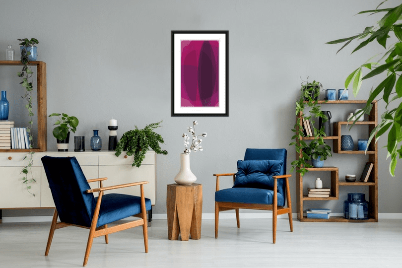
Pantone’s bet for 2023’s color of the year the vibrant Viva Magenta
“An unconventional shade for an unconventional time”, that’s how Pantone described their pick for 2023’s color of the year. This selection certainly points toward experimentation and new visual dynamics. It has a rebellious “out-of-the-box” spirit. Viva Magenta or Pantone 18-1795 is the color of a hybrid world, an exuberant shade found in tangible and virtual spaces
Try out Viva Magenta’s: just enter the color hex code #BB2649.
What to do with Color Swatches
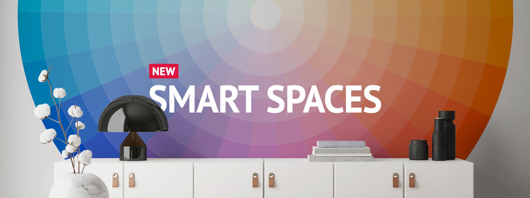
Now that you’ve recapped the basics of Color Theory, got to know the 2023 Colors of the Year, and gone through the top shades per country, you are all set to start trying out different color combinations on your Smart Spaces’ walls. Just sign up to ArtPlacer’s free trial to start experimenting with rooms and colors in room mockups that will enhance your art.
To use ArtPlacer’s Smart Spaces, you just need to upload a picture of your artwork, and “drag and drop” it in a room. Combine different wall colors and framing options, and be amazed by the endless possibilities the color wheel brings to the Smart Spaces’ walls.
Adorei conhecer seu blog, tem muito artigos bem interessantes. resultado das 11horas
Hi Ana Clara, thank you for your kind words! You can follow us on Instagram to get our latest content https://www.instagram.com/artplacer.app
Obrigada!