Art Marketing
How a professional artist website should look in 2026
How important is it to have a good artist or art business website today? Think about it, when someone tells us about something the first thing we do is go to our preferred search engine and make a quick search about it. Now think about your potential audience: what would be the first thing they found about you and how much could they learn about your art practice from it?
That’s the importance of having an updated professional artist or business website. In this time and age, your webpage is both your presentation card, a place to engage with people who are interested in your art, and even your point of sale.
Creating a good website goes beyond having a good design. Keep reading to discover insights, best practices, and tips to create an engaging and memorable artist or art business website that is aligned with both your artistic views and commercial goals.
Contents
An artist’s website: leveraging simple structures and visual hierarchy
Visitors to your website have a clear goal: finding specific information related to you and your work. Your page design should work in your favor by showing all relevant content in a simple way. When it comes to design basics like color palettes, typography, and visuals, aim for simplicity.
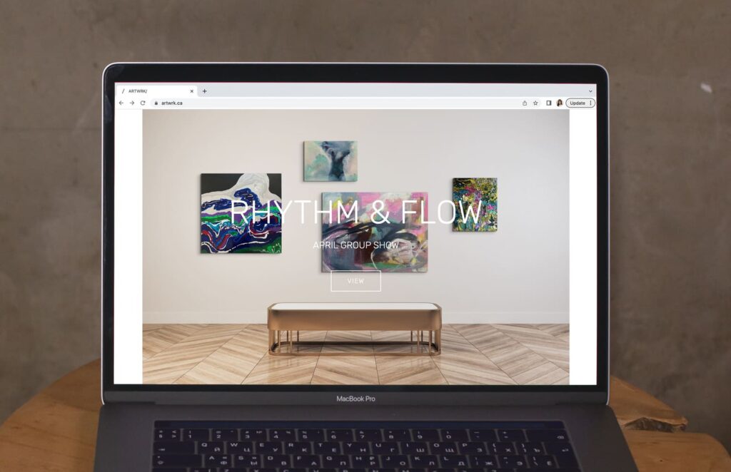
The most relevant part of your content should have at least a sneak peek on your homepage, like your most sold print or a showcase of your body of work. The best practice is to give it a clear call to action. For example, artwork.ca highlights their current exhibition (the place where they want to drive traffic to) along with a clear CTA: ”View”. You can achieve the same look by creating an image of your art in a room mockup that visually places the visitor in context.
Navigating an artist’s website: create a clear path for your visitors
Think of your website as your own gallery. From the beginning, give it a concept and also a clear structure that you want visitors to follow. Improving your website navigability helps users find the information they need easily. Follow this checklist to improve the navigation of your page:
-Show the most important pages in the top menu.
-Add your navigation menu in the footer
-Place your logo at the top left of your page (best practice) and link it to your homepage so users can go back to the main page.
-Add a search bar: make it visible at the top of the page so users can drive their own quick search.
-Include pertinent links into the page copy: do you have a page dedicated to commissions? Add a bespoke section on your main page and link it back to that page.
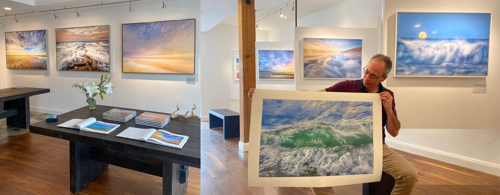
-Add links and images to sections: make clear where they will take you. See the example above: artist Sergio Gomez uses a screen capture of his online art show on his homepage to drive traffic to the exhibition. There is also a simple and clear call to action for the visitor to follow.
Visuals don’t only serve to illustrate or to catch the user’s eye. When it comes to your website strong visuals can help visitors quickly find the content they are looking for. In the example above, check how artist Charles Pedone uses an image of his art in a room mockup to promote his bespoke work.
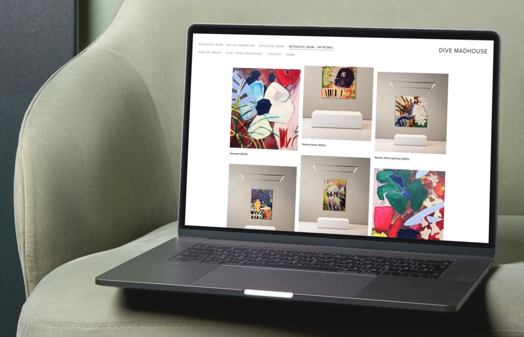
Your website needs to be cohesive in order to visually communicate your style and ideas as an artist. This can be achieved from an overall design point of view, and also with the types of images you use. Take Dive Madhouse’s page as an example, he created a pattern using pictures of his artworks and a similar room mockup that expresses his style.
Achieving this look is easy, follow these steps:
-Choose a room that you like and customize it.
-Place your artwork and tweak details like brightness and shadows.
-Click on “save set up”, that way you can use the same room, style, and edits with other artworks.
–Download the mock-up of your art in place and upload it to your website.
Bringing e-commerce vibes to your professional artist website
Your website can also be your direct-to-sale space. If you are showcasing your available work for sale make sure to add the following things to the description ensuring a better user experience that leads to a frictionless shopping process:
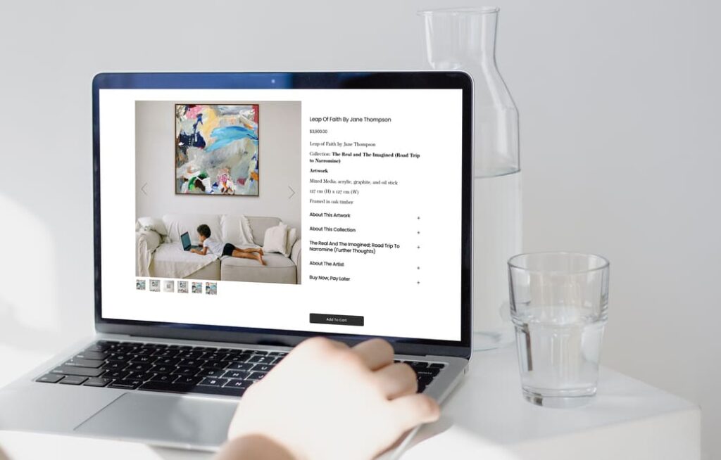
–Share a brief description of the artwork: name, medium, niche or genre, size, and any other detail that could help the visitor make a purchase decision.
-Add visuals: give visitors a better sense of what they could be acquiring.
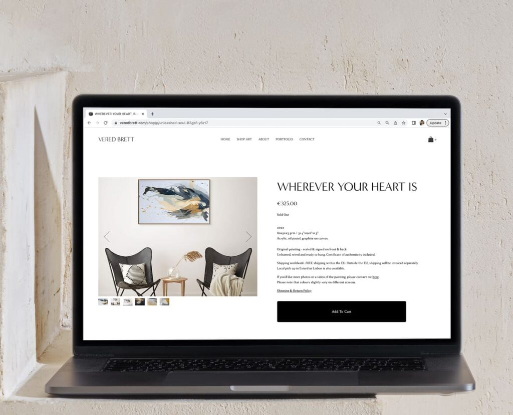
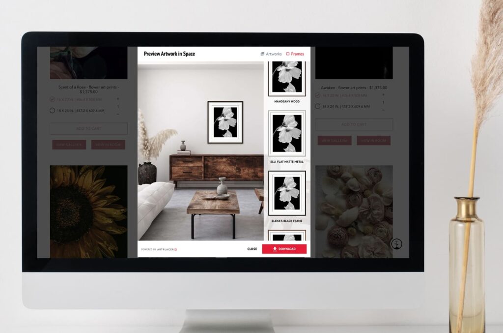
See in the example above how artist Vered Brett has created an engaging experience in each artwork page by combining good quality photos of the pieces with room mockups that showcase them in different spaces and with accurate sizing, giving the visitors a full sense of how her art would look in their space.
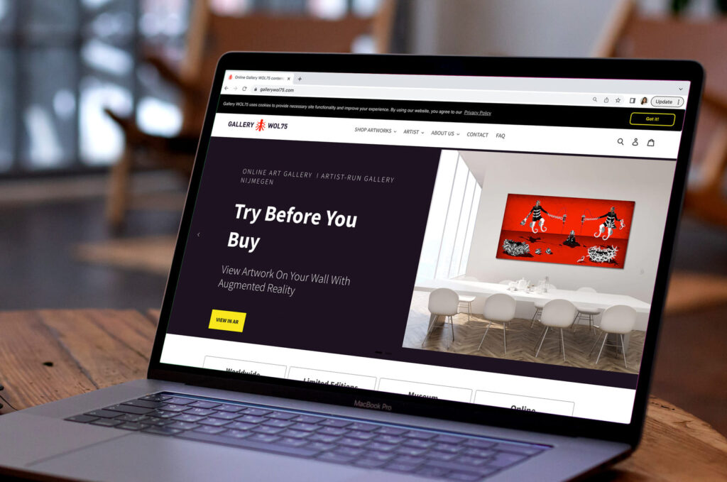
Offer a Try-Before-You-Buy experience on your website
Acquiring art is an investment that goes beyond price and value. At the point of sale, right before they make a purchase, an Art Buyer needs all possible details they should consider before pressing the buy button.
With ArtPlacer Website Integrations you have 3 options to give them a try-before-you-buy experience and close the deal:
–Clients room: enables the visitor to upload a picture of their room and layout your artwork in its precise size to see how it would look.
–Augmented Reality Widget: the visitor can download for free the ArtPlacer AR Mobile App, point at their wall with their mobile device, and see how it would look with augmented reality technology.
–Sample room: the client will be able to lay out your artworks in a series of pre-selected rooms and have a better idea of how it interacts with the space.
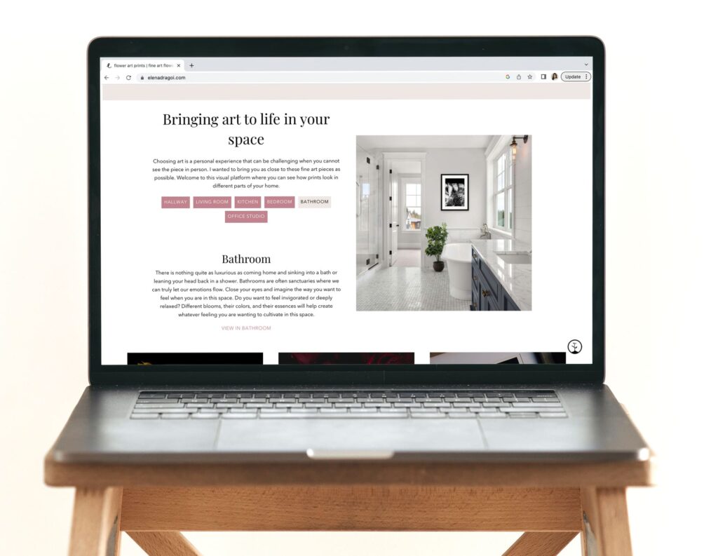
See above how artist Elena Dragoi presents the Sample Room widget on her artwork page.
Promote your newsletter on your website
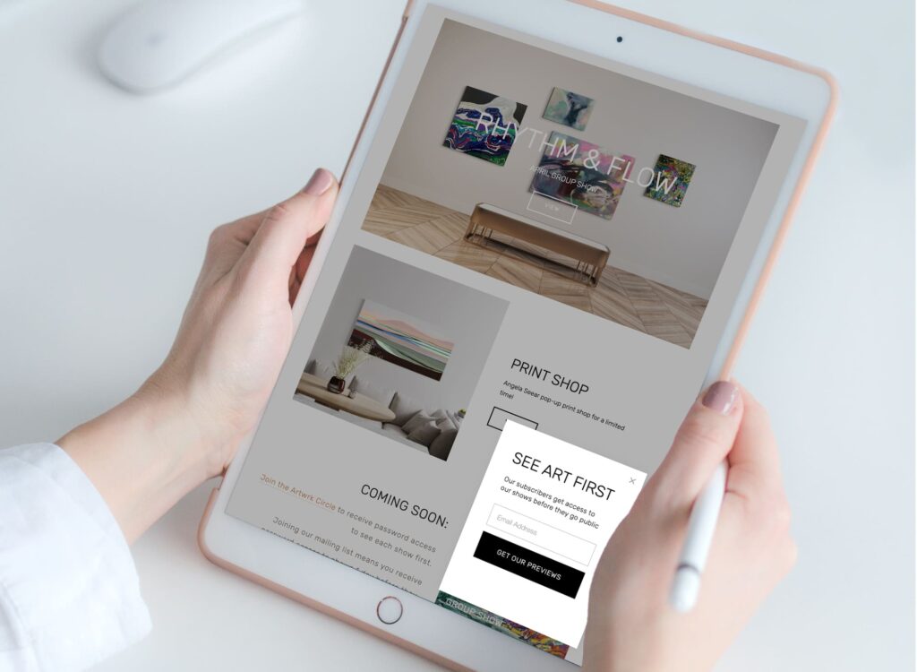
Email pushes are an essential part of art marketing strategies. But how can someone follow your latest news and all the content you have prepared if they don’t know where to sign up? How can you also grow your mailing list?
ArtPlacer now offers lead-generating features that will help you with this task. There are a few integrations you can activate that will help you grow your mailing list, for example the “Subscribe form” that will help you collect leads data.
Another option is turning a Virtual Exhibition into a lead magnet by activating the “Request visitor’s information to access” option when editing. This way, visitors will be requested to provide their name and email to access the show, and you can organically grow your contact list.
All collected data can be managed from the new “Contact” tab on your ArtPlacer profile, and you can download it and take it to your email management software to send timely newsletters and communications.
Begin generating leads and connecting with potential collectors: start your ArtPlacer free trial today.
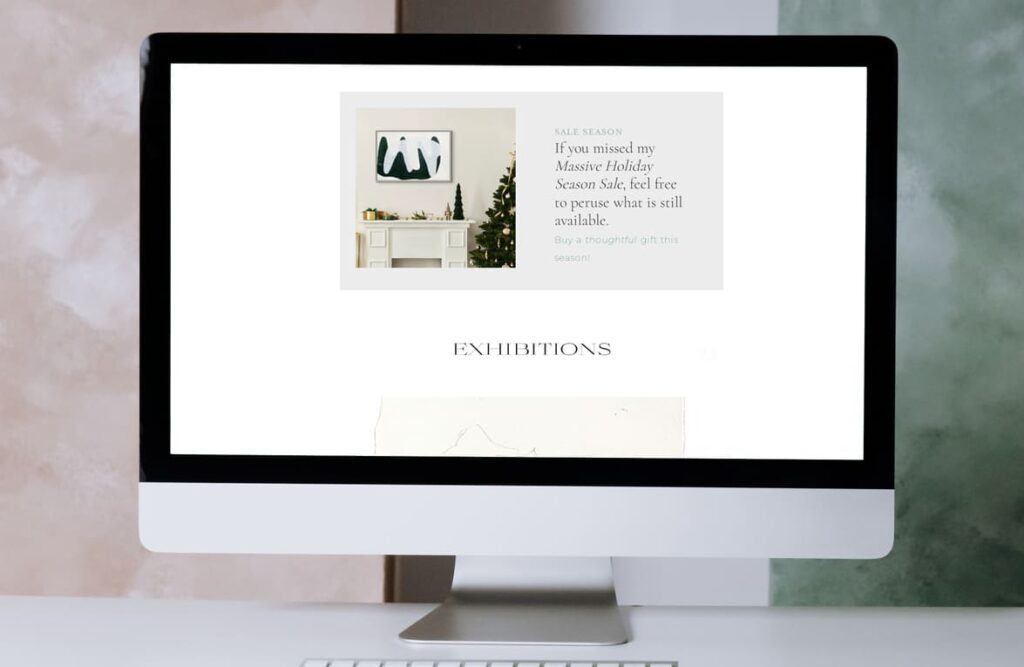
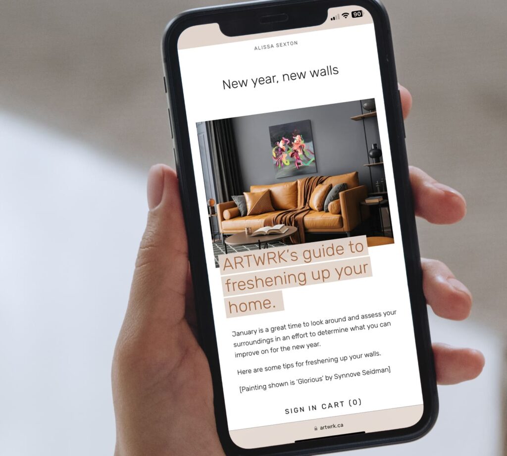
If you want to walk the extra mile to engage with your audience and familiarize them with your art, a good idea is to use Room Mockups as email banners, headers, or complementary images. It will get people a clearer view of your aesthetic and vision.
Share your ideas with a blog
Your blog is a space to talk about you, your process, your creations. It’s a window into your world, and because of that, a best practice many artists in our community have applied is creating different mockups of their art in a variety of rooms as supportive visual content for their texts.
Think outside the box: make each visit to your website a memorable experience
Our goal at ArtPlacer is to provide artists with the features and the assets they need to showcase their art in innovative ways. These are a few ideas we collected from our thriving community of artists and gallerists, with the intention of sparking your creativity and finding new and creative uses for the tools you already know.
Take a look at the example above. Artist Elena Dragoi used mockups of her art in digital rooms to create an engaging experience on her professional website. If a visitor is interested in her artworks but doesn’t know exactly where they would place them, they can toggle between different pre-selected rooms showcasing her art and have a better idea of where and how they could present them in their own houses, offices, or any other spaces.
In this way not only is she developing a relationship between her, her work, and the visitor, she is giving them a memorable experience, augmenting the amount of time they spent on her website and driving them further in her art marketing funnel.
How are you going to improve your website? Share your ideas and results with #ArtPlacer to be featured.